How to use colour on skirting board & architrave
What colour should I paint my skirting board & architrave?
For decades the classic colour for internal decorative mouldings has been white, however, recently painting skirting boards, door architrave, dado rail and picture rails a different or contrasting colour has been on trend. In this article we will show you the options for using colour on your decorative mouldings for different effects, and outline considerations for those who are pondering what colour to paint them.
Want to start with some inspiration?
There's some wonderful examples of colour use in our Customer Success Gallery to get you started.
What are the interior design principles behind colour choice?
All colour schemes revolve around two primary principles:
- Contrast
- Continuity
Your decorative moulding colour choice can be used to achieve either of these principles, and in the process can also manipulate the perception of height in a room or help draw attention to other room features. The balance you choose to strike between contrast and continuity will depend on what you want from your colour scheme. So first thing to do is ask yourself some questions so as to inform some of the themes we will talk about further down:
- Do you want to use strong or pale colours?
- Are you trying to draw the eye to other features in that room (or on that wall)?
- Do you need to inject a new colour into the scheme?
Contrasting skirting board colours
Colour schemes featuring deep, strong colours always stand out, whether the colour is used throughout the room, or just on a feature wall.
However, a strong colour is often most effective when contrasted against a secondary colour. A secondary colour acts as a balance, and stop the primary, bold colour being too overbearing.
White is a good primary or secondary colour to employ this technique. This is why skirting boards are often painted white. White will complement almost any other colour in your room.
White can be especially striking when used with darker colour schemes, and can both brighten a room, and lift the tone of a colour scheme, whilst providing contrast. This contrast can be very effective, as it will serve to ‘frame’ the wall they are fixed to and provide an immediate, side by side colour contrast.
The interior from Style By Emily Henderson shown here does this particularly well. The white skirting boards in stark contrast against the blue wall colour, lifts what would other-wise be a dull scheme, but also gains continuity with the white pictures, light shades, throw and ceiling.
This provides a dual-coloured foundation on which to introduce further feature colours, in this case being the leather furniture which particularly draws the eye. The result is a powerful, but well balanced, contrasting interior.

Image credit: Style By Emily Henderson
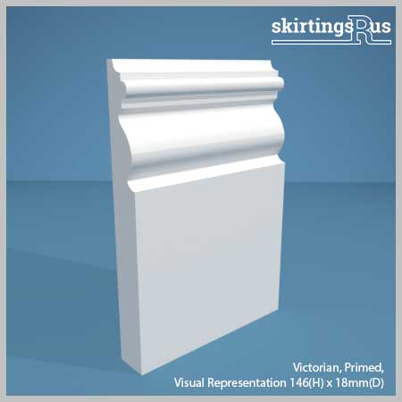
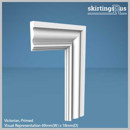
Recreate this contrasting colour look with Victorian skirting board
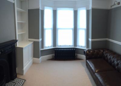
It is also important to note that contrasting effects can look equally effective with light coloured walls contrasting with dark skirting colours. Check out the black skirting boards in the interior below.

Image Credit: House & Garden
Recreate this contrasting colour look with Large Victorian skirting board and architrave
However, contrast can also be pulled off well with lighter colours. Painting mouldings and doors can be a really good way of bringing colour into the room – especially if you have white walls like in the image below.

Image Credit: sfgirlbybay.com
Or contrasting skirting board colour can work just as well when using accent wall colours in a room, so using white skirting against a darker accent colour can really creating a striking focal area of the room, as in the image below.

Image Credit: Bed Kingdom
Try these skirting and architraves with contrasting colours
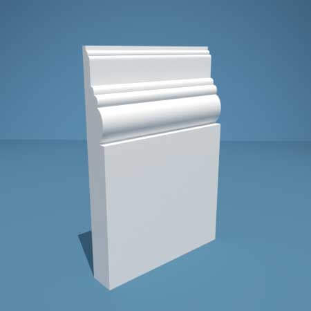
Victorian MDF Skirting Board
From: £6.69
View Details
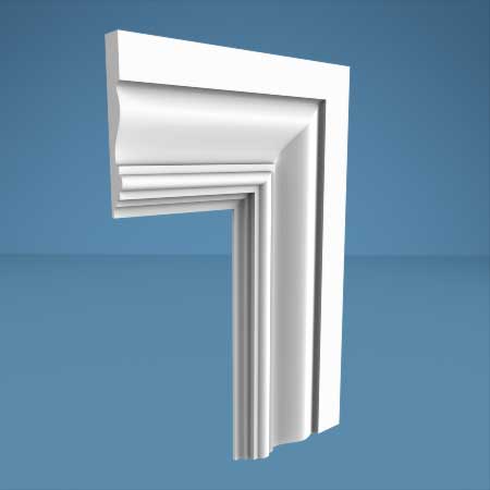
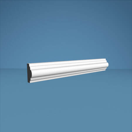
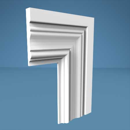
Large Victorian MDF Architrave
From: £10.05
View Details
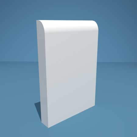
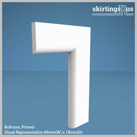
Bullnose MDF Skirting Board
From: £6.15
View Details
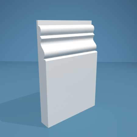
Torus Small MDF Skirting Board
From: £6.69
View Details
Continuous skirting board colours
Continuity can be just as effective as contrast. Painting your skirting the same colour can deliver several effects.
Firstly it can deliver a borderless room opening up the space (particularly if light colours are used), and have a calming effect on an interior, by reducing the number of contrasts. It will also maximise the feature effect of a wall if it is one slid block of colour, rather than being trimmed with a white skirting board.
Secondly, your wall can create a ‘background’ and give you a blank canvass on which to place a prominent feature or piece of decoration. The eye will then be naturally drawn away from the plain wall to the contrasting decoration. The features will be emphasised, as the eye won’t get caught by the contrasting colours of wall and skirting.
The room below creates this background effect particularly well, by using a small skirting board painted the same colour as the wall with the eye being drawn to the yellow of the sofa, and the white of the art on the wall.

Image Credit: Cote Maison
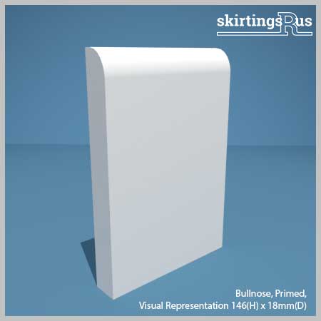
Recreate this continuous colour look with Bullnose skirting board
The bathroom below also achieves the background effect very well, with the eye being drawn to the mirror, light, sink and towel.

Image Credit: Sheer Luxe
Recreate this continuous colour look with Torus Small Skirting Board
A word of caution
Colour contrast is an important tool when generating a colour dynamic, so don’t allow the continuity to go too far and overpower the room – it still needs to be balanced with some contrast.
The key is to decorate/furnish the wall; bringing feature elements with art, pictures, mirrors, or positioning furniture in front of it. The floor colour also helps to bring contrast in all of these examples.
We spoke with Zoey over at Wood Flooring Ireland for their expert opinion on floor colour and the importance of space:
“We can’t overstate the importance of balance – what you want to do is create a striking, yet cohesive atmosphere in the space, but your wall colours, skirtings and flooring choices shouldn’t clash, instead they should compliment one another. Darker floors, dark walls should be paired with brighter skirtings and mouldings so as to breathe life into the space. You want to exploit the space, not suffocate it.” – Zoey Dromgoole, Interior Design Expert, Wood Flooring Ireland.
Compare the two interiors below and see the difference:
This grey interior feels more balanced, despite the skirting being the same colour.

Image Credit: Zoopla
Recreate this continous colour look with Kensington Skirting Board
Whereas the blue in this second interior feels overbearing and somewhat empty.

Image Credit: Paint and Paper Library
Recreate this continuous colour look with Antique skirting board and Palace architrave
Using a New Room Colour on Your Skirting Boards
The examples we have looked at so far feature colour palettes that are already use the skirting board colour elsewhere in the room, but what if you want to introduce a completely new colour? Without upsetting the colour scheme to much, one of the best ways of doing it is to introduce a new colour which is to introduce either a similar shade or tone of a colour in your room.
This technique provides both further layers of colour with a limited contrast, but one that also maintains similarities with you original colour. This can be very effective method of introducing a new colour while still maintaining a balanced colour palate. Decoration can then be used to provide greater contrasts if necessary.
In the Paper Mulberry example shown here, grey coloured skirting is a slightly different shade to that of the kitchen units but shares a tone with most of the colours in the room, while the wine rack is a totally different colour, but maintains a similar tone.

Image Credit: The Paper Mulberry
Recreate this new colour look with Square skirting board and Torus Small architrave
Try these skirting and architraves with continuous colours
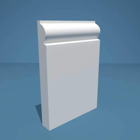
Kensington MDF Skirting Board
From: £6.69
View Details
Antique MDF Skirting Board
From: £6.69
View Details
Palace MDF Architrave
From: £10.05
View Details

Torus Small MDF Architrave
From: £6.94
View Details
More resources
This guide should have given you some good ideas about how to select the right colour for your skirting boards, but Dulux and Farrow and Ball also offer great guides on how to create a colour scheme for your interior should you need more help.
For further hints and tips, we also provide regular news and hints to our email subscribers (with the occasional exclusive offer!) which you can sign up to below.
Related Posts

Plinth Block & Rosette Dimensions Guide